
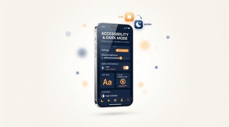
Dark mode has become the standard on almost every site and app — users love it, it saves battery on OLED screens, and it's sometimes even seen as "more accessible." But switching to a dark color palette, if done without careful thought, can actually hurt accessibility. This article explains how to do it right.
In short — what this article covers
When dark mode helps accessibility
For users with light sensitivity (photophobia), migraines, or digital eye strain, a dark background can significantly reduce discomfort during extended use, especially in a dark environment. Some users with dyslexia also report more comfortable reading on a dark background.
When it actually hurts
On the other hand, for users with astigmatism (a common vision impairment), light text on a dark background creates a "halation" effect that makes letters look blurry — sometimes a light background with dark text is actually more comfortable for them to read. The upshot: there's no single right answer for everyone, which is why the best solution is to let the user choose, not force one mode on them.
💡 An important point
Most important: never rely solely on the automatic system setting (`prefers-color-scheme`) without giving the user a way to switch manually on the site itself — not everyone whose system is in dark mode wants the site to be dark, and vice versa.
Contrast in dark mode is different from light mode
A common mistake: taking the same text colors from light mode and simply flipping the background to dark, without re-checking the contrast ratios. Pure black (#000000) on pure white gives a maximum contrast of 21:1 — but the reverse, pure white on pure black, creates an especially strong "halation" effect that tires the eyes. It's better to use a dark gray background (for example #121212) instead of pure black, and off-white text (for example #e8e8e8) instead of pure white — this still meets WCAG's contrast requirements (explained in detail in our guide on color contrast), but is significantly easier on the eye.
Practical rules of thumb
- Check contrast separately in each mode — light and dark — not just once.
- Avoid especially saturated colors (bright red or blue) on a dark background — they tend to visually "vibrate" and make reading harder.
- Keep a manual toggle on the site, not just reliance on the system setting.
- Check images and logos designed for a light background — they sometimes need a separate version for dark mode to stay legible.
Are your documents ready for dark mode too?
Many PDF files today are opened in the dark-mode view of reader apps — our tool checks that the text contrast in your documents meets the standard in every mode.
Scan your site for free ←After scanning, you can also make the documents that were found accessible directly and for free via AccessiDoc.